Qualer

QualerVersion PowerBI -Powerful Software for Data Visualization

FromQualer
SHARE

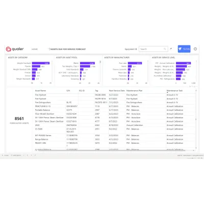
Qualer employs Microsoft Power BI as the foundational technology for its data visualization tools in asset management. This business intelligence solution empowers users to bridge the gap between their operations and data, allowing for the generation of instant insights through a variety of pre-built reports and customizable options. Users can explore relationships between various operational facets, such as assets and service records, client-managed assets, as well as the financial implications of asset maintenance. Specialized reports like the Asset Time to Failure Report measure asset reliability, while the Assets Due for Service Forecast Report predicts upcoming service needs based on maintenance schedules. The Failed Service Records Report identifies problematic areas to prevent future breakdowns, and the Overall Asset Effectiveness Report evaluates asset performance through metrics like uptime and quality. The system also provides a Service Events Report to enhance operational efficiency by identifying emerging patterns.

Most popular related searches

Take your operation to the next level using data visualization tools

Qualer uses Microsoft PowerBI™ as a backbone technology. Our Business Intelligence solution bridges the gap between you and your data. Get instant insights with our growing repository of canned reports or create custom reports using our preconfigured data set.

Reports include:

  • Asset Growth
  • Asset Time to Failure
  • Failed Service Records
  • Service Costs
  • Assets Due for Service
  • Overall Asset Effectiveness
  • Uptime
  • Service Events
  • Order Turnaround

Power BI™ Data Visualization Tool Provide the Asset Time to Failure Report

Use the Asset Time to Failure Report to see how much time passes before assets must be re-serviced. Time to failure measures an asset’s reliability, and it tells you how long, on average, you can use the asset before it needs to be re-serviced.

Powerful Business Intelligence Gives Adds The Assets Due for Service Forecast Report

See into the future with our Assets Due for Service Forecast Report. Know which assets will be due for service based on their maintenance plans and anticipate your workload.

Failed Service Records Report Presented on the Dashboard Data Visualization

Use our Failed Service Records Report to understand which assets and service records are failing. Avoid future failures by finding their cause.

Qualer's Data Visualization Dashboard Shows Your Asset Growth Report

The Asset Growth Report shows the running total for company assets.

One of the Best Tools for Data Visualization in Asset Management

Qualer’s Overall Asset Effectiveness Report measure’s an asset’s performance. Identify poor-performing assets based on asset uptime, performance, and quality.

Power BI™ Data Visualization With an Uptime Report

The Uptime Report shows you how often assets are available vs. unavailable due to maintenance. Uptime can serve as a metric for asset health and help identify assets that are performing poorly.

Best Software for Data Visualization When It Comes to Service Events Report

Get insights from all your orders with our Service Events Report. Unlock new efficiency with uncovered patterns.

Power BI™ Is a Reliable Data Analysis and Visualization Software in Order Turnaround

Order Turnaround is a metric of how long an asset spends between when it was submitted and completed. The Order Turnaround Report shows how the average turnaround changes monthly and which assets take the most extended/shortest time in service.